2retro
Well-Known Member
- Joined
- Feb 5, 2015
- Messages
- 1,895
- Reaction score
- 315
- Points
- 83
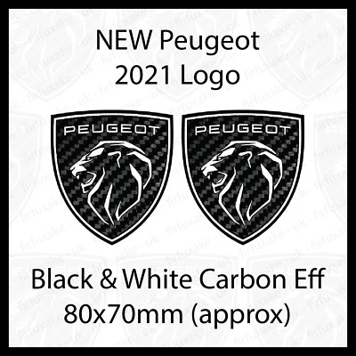
Peugeot is a brand that chooses to regularly overhaul the logo. In the 1960s, the classic shield with a heraldic lion was replaced by a shield with only a lion's head. As of 1968, the shield is omitted. The complete lion returns in 1975, but still without a shield. This logo has since evolved into a sleek stylized lion. So the lion is actually the only constant.
A logical next step would be an even tighter and more modern lion, but that's not what the French do. They take a different approach and go back to the past. The new logo is therefore very similar to the logo from the 60s. So a shield with a lion's head.
According to Peugeot, the logo is part of the strategy to put the models higher in the market. Within Stellantis, Peugeot, together with Opel, is positioned between Citroën and Fiat on the one hand and DS, Alfa and Lancia on the other. In other words, a semi-premium positioning.
The new logo may also look familiar if you have never seen a Peugeot from the 60s. Just like with Kia, the logo debuted on a concept car, in this case, the very successful e-Legend from 2018. A full rebrand of all Peugeot cars and showrooms will be completed by 2023.
What do you think of it? Personally, I think it looks great! It's got styling elements of Porsche and Ferrari in that logo, such as the shield shape and font used, and it manages to look modern and traditional at the same time.